Sureify
UX INTERNSHIP SUMMER 2017 – PRESENT
The summer of 2017, I interned at a seed funded insurtech startup called Sureify at their headquarters in San Jose, California. Sureify focuses on building enterprise engagement tools for Life Insurance companies. As a UX intern, I performed market research, restructured their backend platform IA and designed new features for their web and mobile offerings.
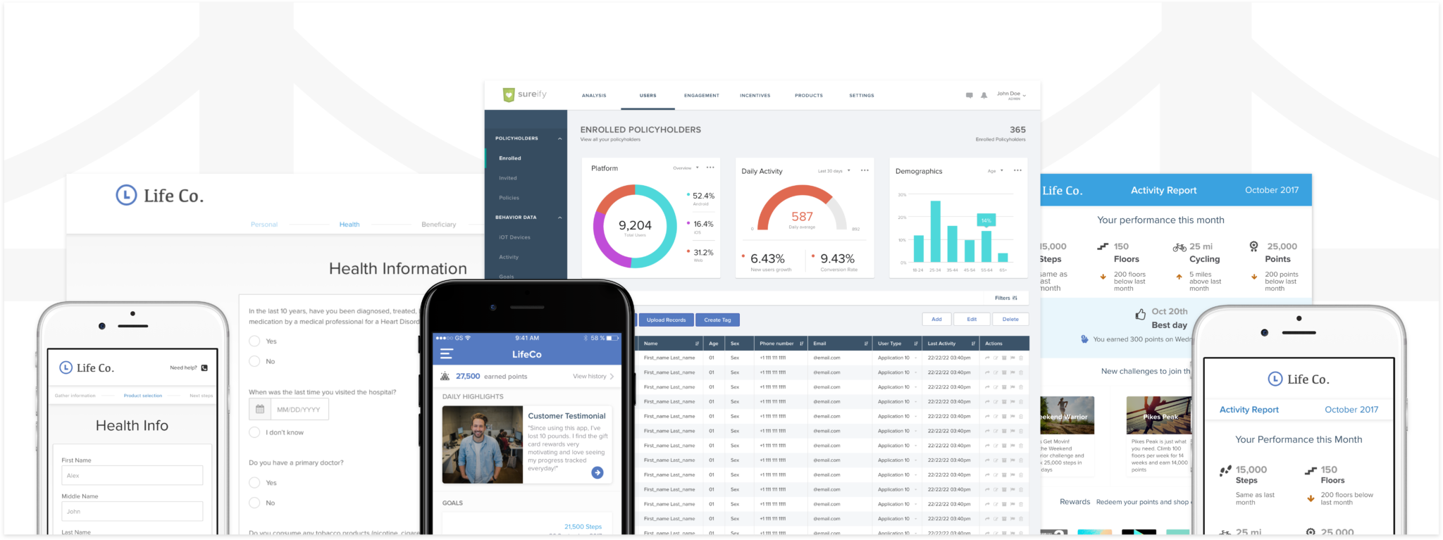
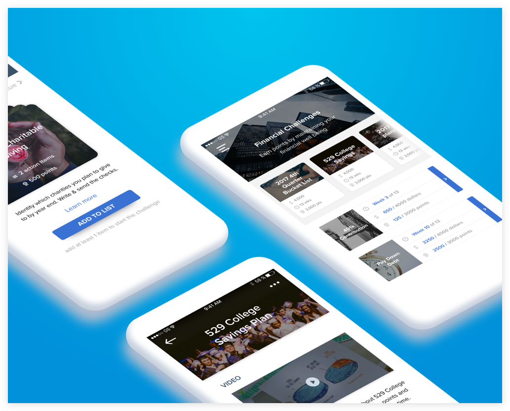
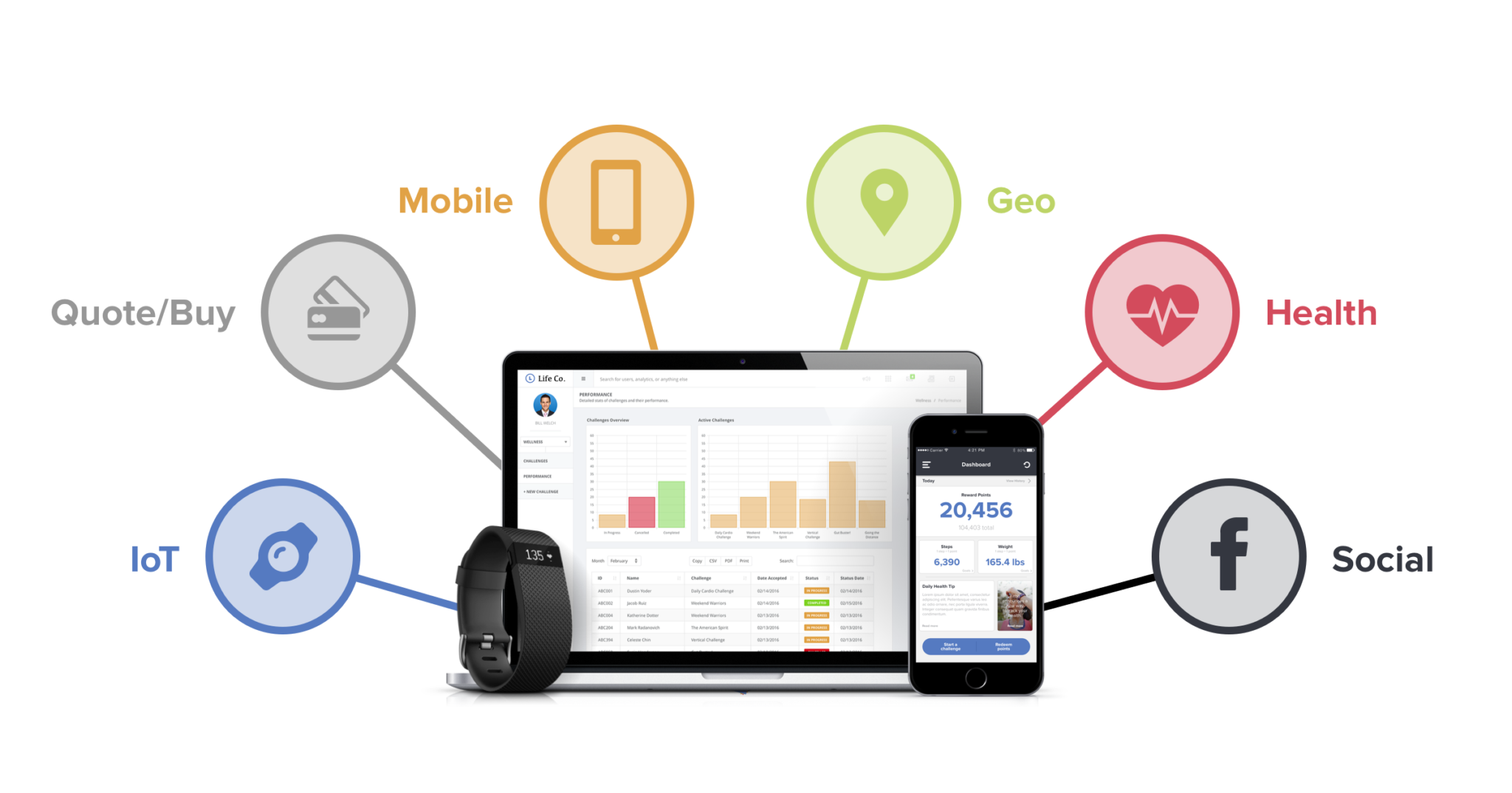
A glimpse of my array of deliverables
About Sureify


The Sureify Team
My Role
- Market Research to understand the Life Insurance startups.
- Heuristic Evaluation to identify UX issues with the mobile application.
- Redesigned a phase one of Sureify’s life insurance engagement platform(SASS) with a scalable Information Architecture.
- Contributed in the design of the life insurance quote and purchase flow which increased user engagement and helped the company bag more clients.
- Designed sales and marketing materials like emails and decks.
Market Research
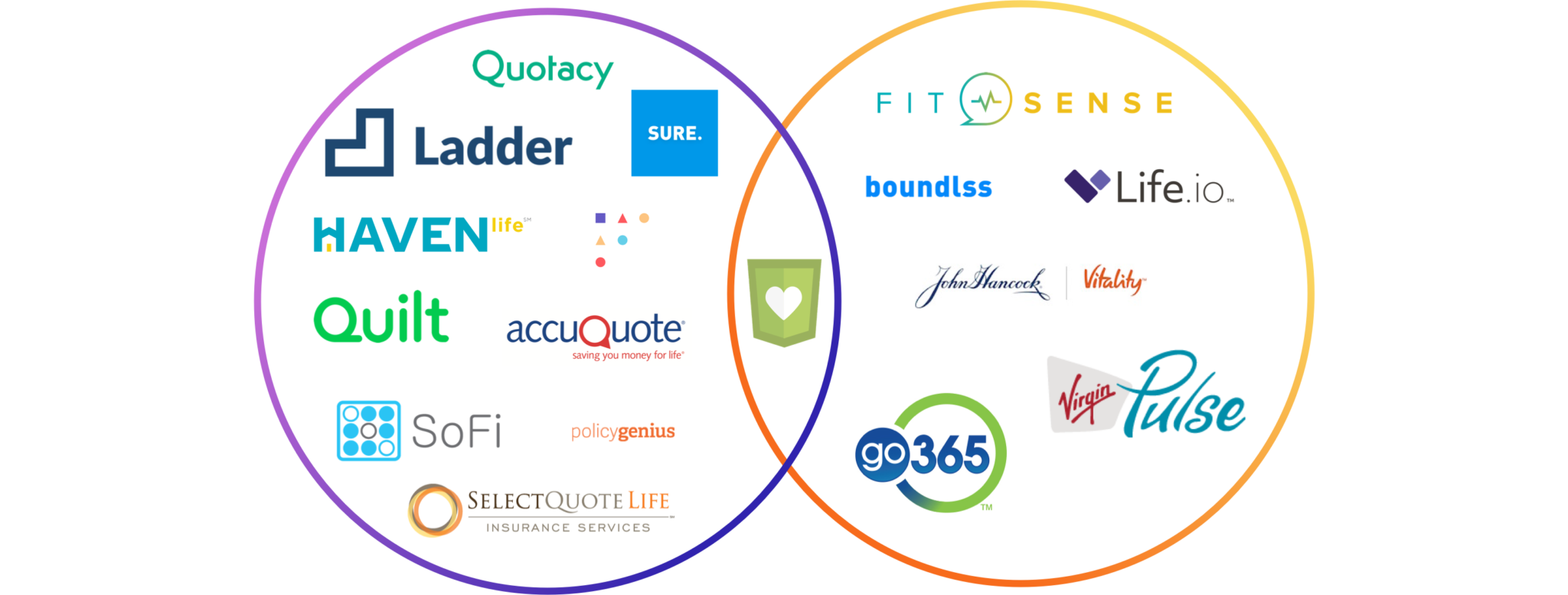
1. Life Insurance Apply & Buy Startups
These startups have created their own life insurance policies and are backed by big re-insurers like Fidelity, Hannover RE, MassMutual, Vantis, etc. They are essentially digital life insurance companies that could be building a digital life insurance platform for their re-insurers.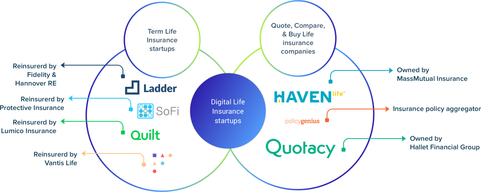
2. Life Insurance companies using the Vitality program
These are insurance companies that adopted the Vitality Health and Wellness solution for their policyholders. Vitality is used by health and life insurance companies to reward policyholders to maintain an active lifestyle. They offer incentivized points-based challenges to redeem points on gift cards, movie tickets, etc. Vitality is fairly widespread and adopted by major insurance organizations around the world. Similar to Vitality, there are Virgin Pulse and go365 that follow the same approach for other industries like corporate and private organizations.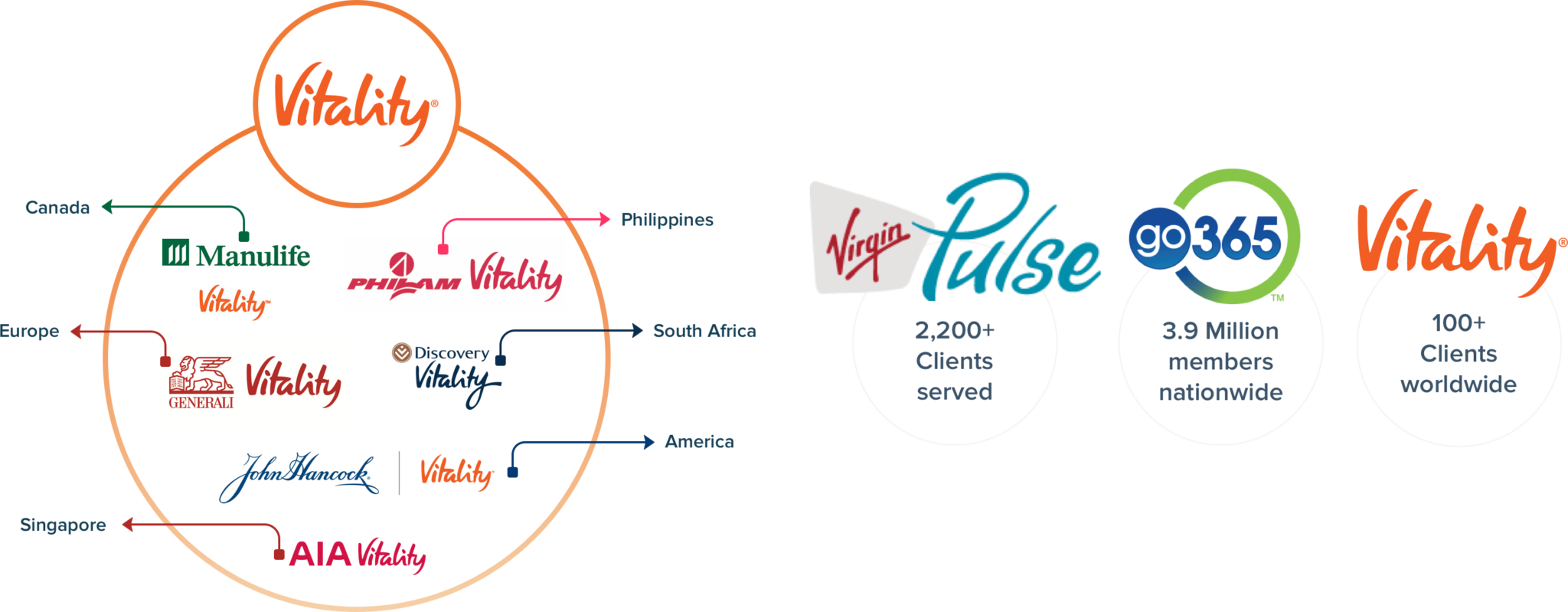
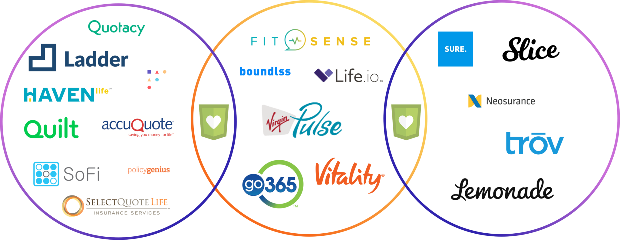
3. Building a white label product for insurance companies
These are startups that not only follow a similar model as Vitality for health and wellness, but also are creating a white-label product for life insurance companies to better engage with their policyholders. These startups provide the insurance companies access to a lifetime worth of health data to improve their insurance policies for the betterment of their policyholders.
4. Insurance companies investing in wearables
Wearables are here to stay and they are being leveraged by many startups in auto, health and life insurance. Startups in auto insurance are creating automobile tracking devices to monitor the health of a vehicle to improve auto insurance for their customers. Eg. Metromile and Progressive. Health insurance startup, Oscar is partnering with Fossil for misfit wearables and AXA a large life insurance corporation is using Withings Pulse for their customers.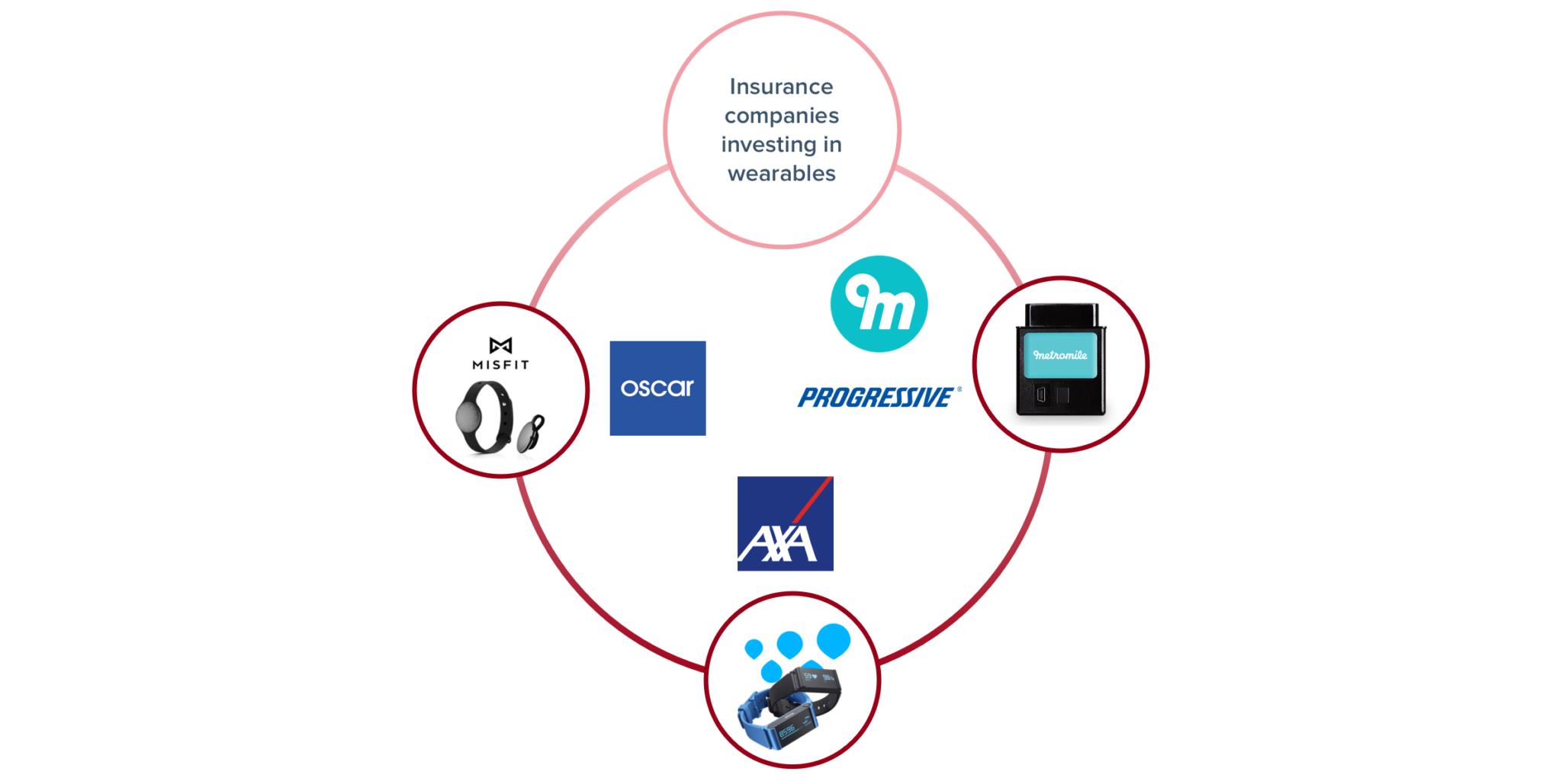
5. AI focused on-demand consumer products insurance startups
These startups are the most heavily funded of them of all. Property & Casualty startups offer protection for home and renters insurance and on-demand consumer goods like a cellphone, expensive jewelry, etc. The uniqueness of these startups is that they are AI focused with conversational UI based apply and buy process. They also offer rapid claims resulting in a fast and pleasant claim experience.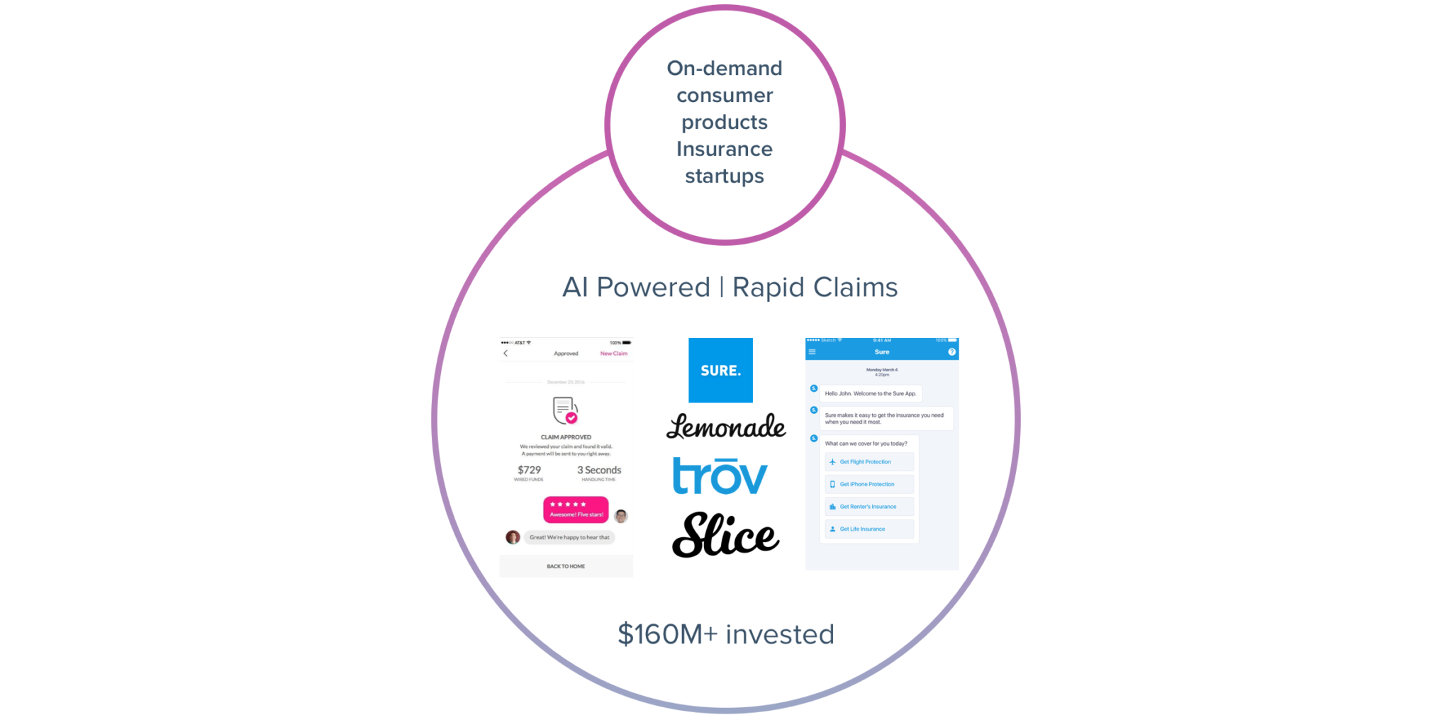
Where does Sureify stand right now?
Where should Sureify aim to be?
Heuristic Evaluation

1. No provision to resolve access code errors
Users do not have an instant solution to resolve access code errors incase the user forgets his/her access code. Although the help documentation mentions the required solution, it would be better if the user is directed upfront.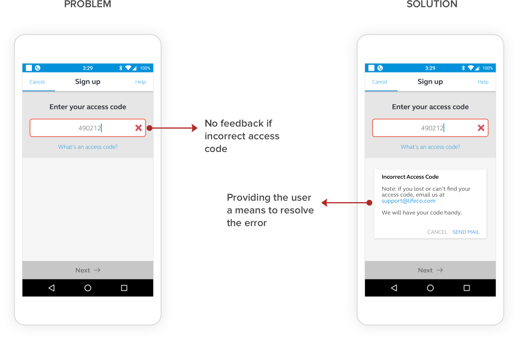
Heuristic – Help users recognize, diagnose, and recover from errors
2. Repeated text and improper use of whitespace
Repeated text elements and an obscure close icon. The video text should provide more context to the user about the contents of the video.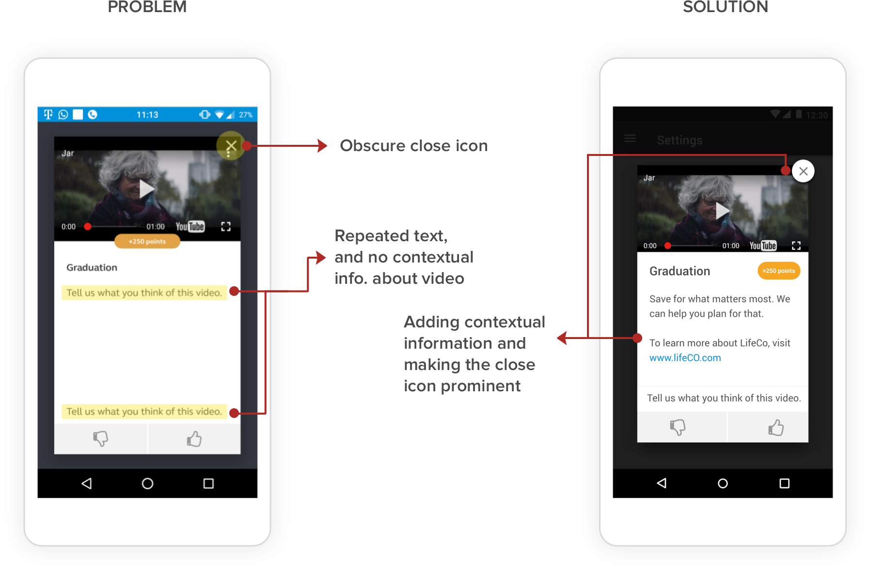
Heuristic – Aesthetic and minimalist design
3. Contact support error message
Error message should offer an action that guides the user to a solution. The system informs user about error information but no action. The system design needs to employ options to contact support if the system crashes or becomes unresponsive.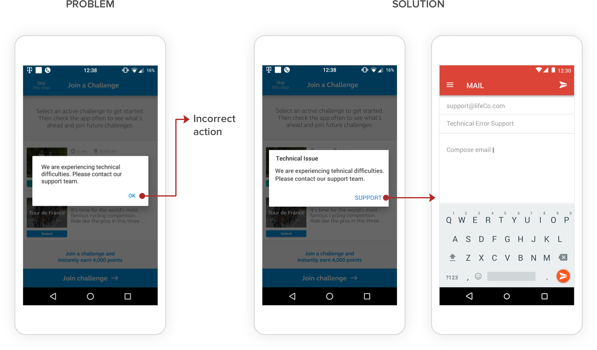
Heuristic – Help users recognize, diagnose, and recover from errors
Information Architecture
How did I achieve a scalable and systematic IA ?
Step 1
Auditing the Web application
1. Performed a walkthrough of all the screens 2. Thinking aloud the actions on each stage 3. Experienced errors with the user flow 4. Noted misplaced backlinks and other dev bugs 5. Identified all the tabular data and their operations 6. Overall, documented the experience, sitemap and features on a shared Google doc.

The questions asked while auditing the application
Step 2
Documenting the existing IA and identifying problems
1. We found a mismatch between the primary navigation elements and the content displayed 2. Discrepancy between the organization of the primary navigational elements and corresponding secondary elements. 3. The IA was not scalable to accommodate new application features 4. Overall, the navigational structure needed a revamp I whiteboarded the current system sitemap and analyzed the relationship between the primary and secondary navigation. I was looking for patterns where I can club similar pages together which logically make the most sense.
Fig. Existing system sitemap
Step 3
Card Sorting
Performing card sorting with the lead designer of the team helped me logically identify and narrow down the different pages of the insurer engagement center.
Fig. Analyzed the current system sitemap and performed card sorting activity
The Outcome
I came up with a scalable structure which gave Sureify a place to logically add new secondary features under the correct primary elements.
Fig. Rethinked Sitemap
What Improvements were made to the navigation with the new IA ?
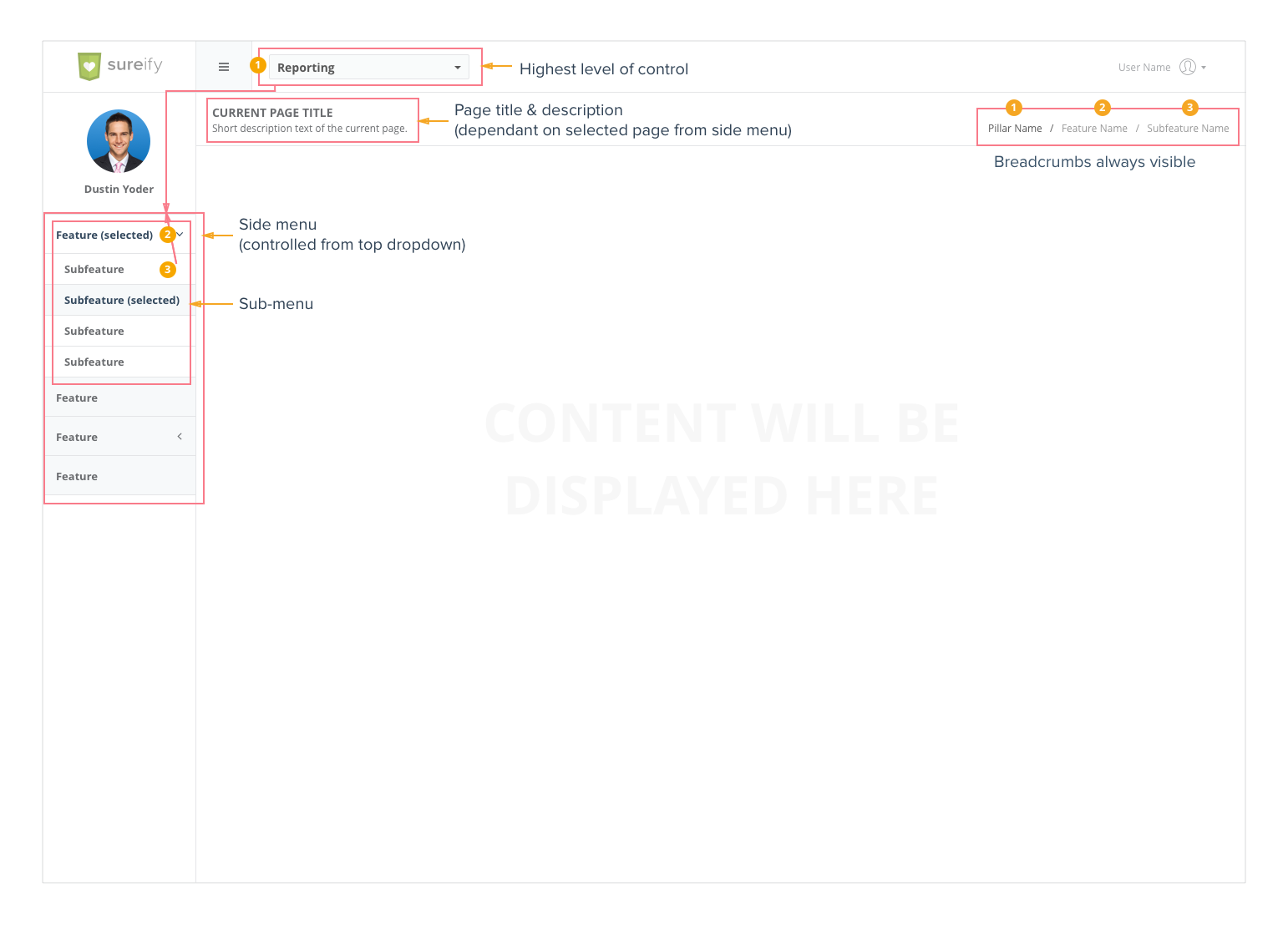
Fig. Existing Insurer Engagement Center
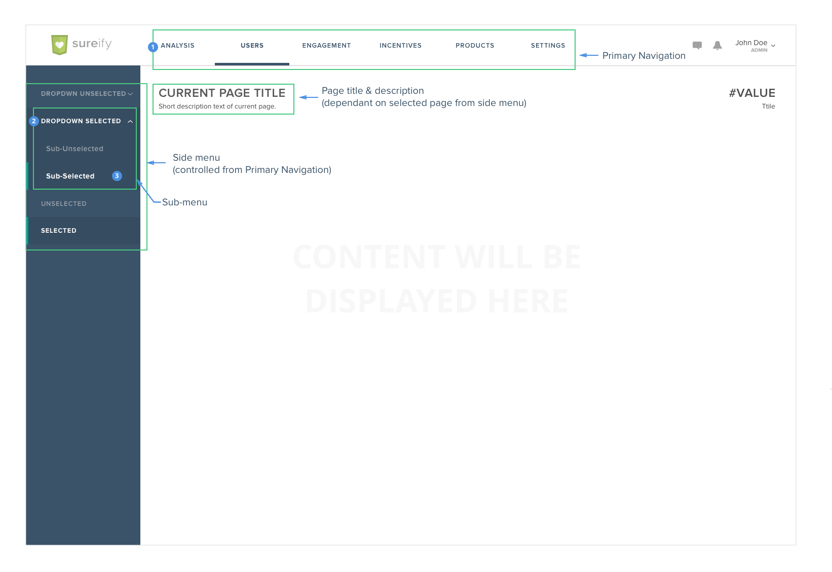
Fig. Redesigned Insurer engagement center
Design Decisions
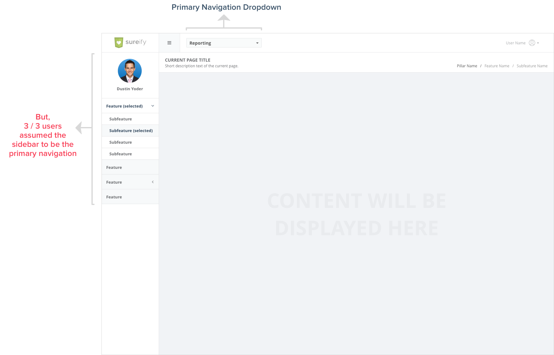
Fig. Difficult to differentiate between primary and secondary navigation.
Rethinking the primary header

Fig. Existing header
Post card sorting I was able to come up with the essential higher level navigation structure which eliminated the dropdown menu. The unused whitespace gave me enough space to effectively organize the primary navigation elements. This increased discoverability of the higher order pages.

Fig. Redesigned header
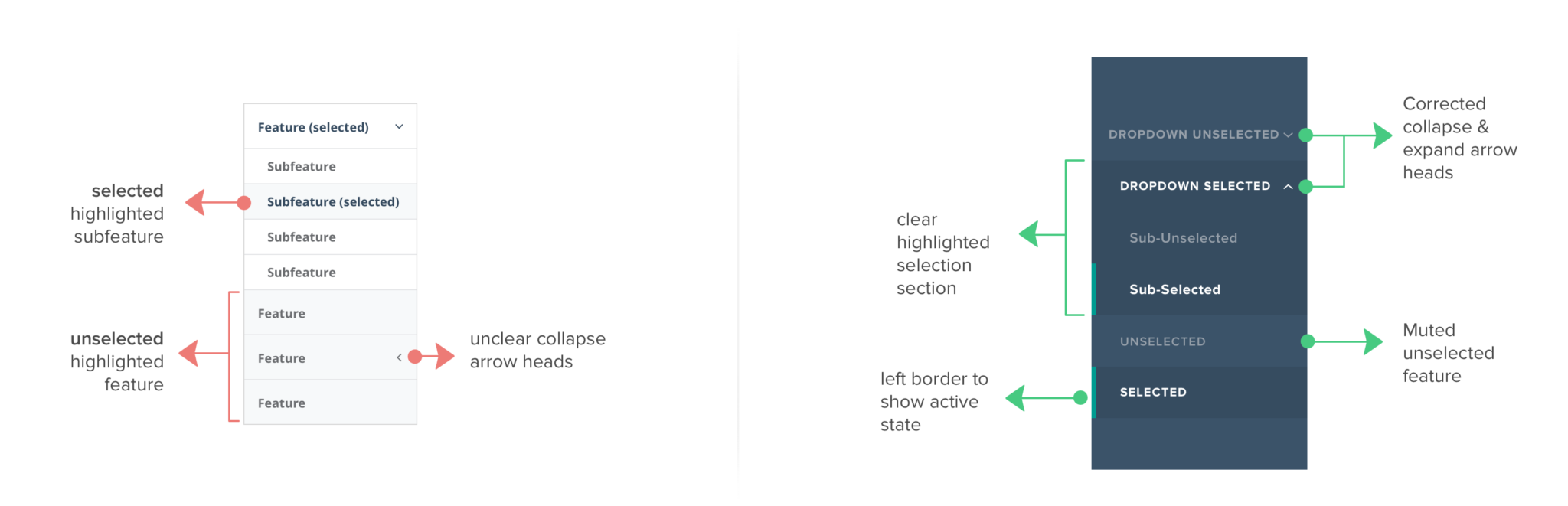
Fig. Existing sidebar (left) and Redesigned sidebar (right)
Redesigning the content and inner pages based on the new IA
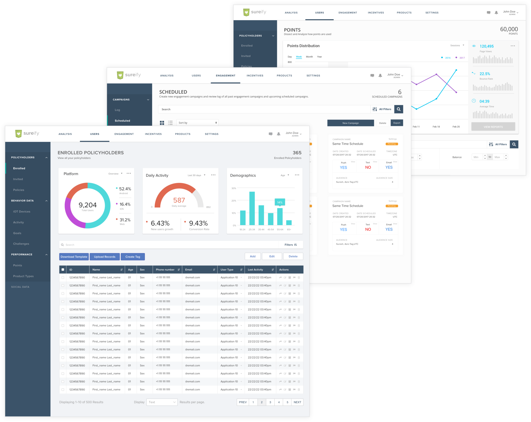
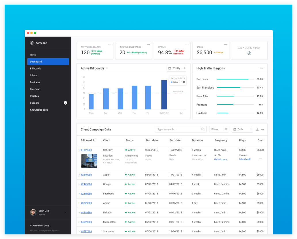
Fig. Insurer Engagement Dashboard (Backend)
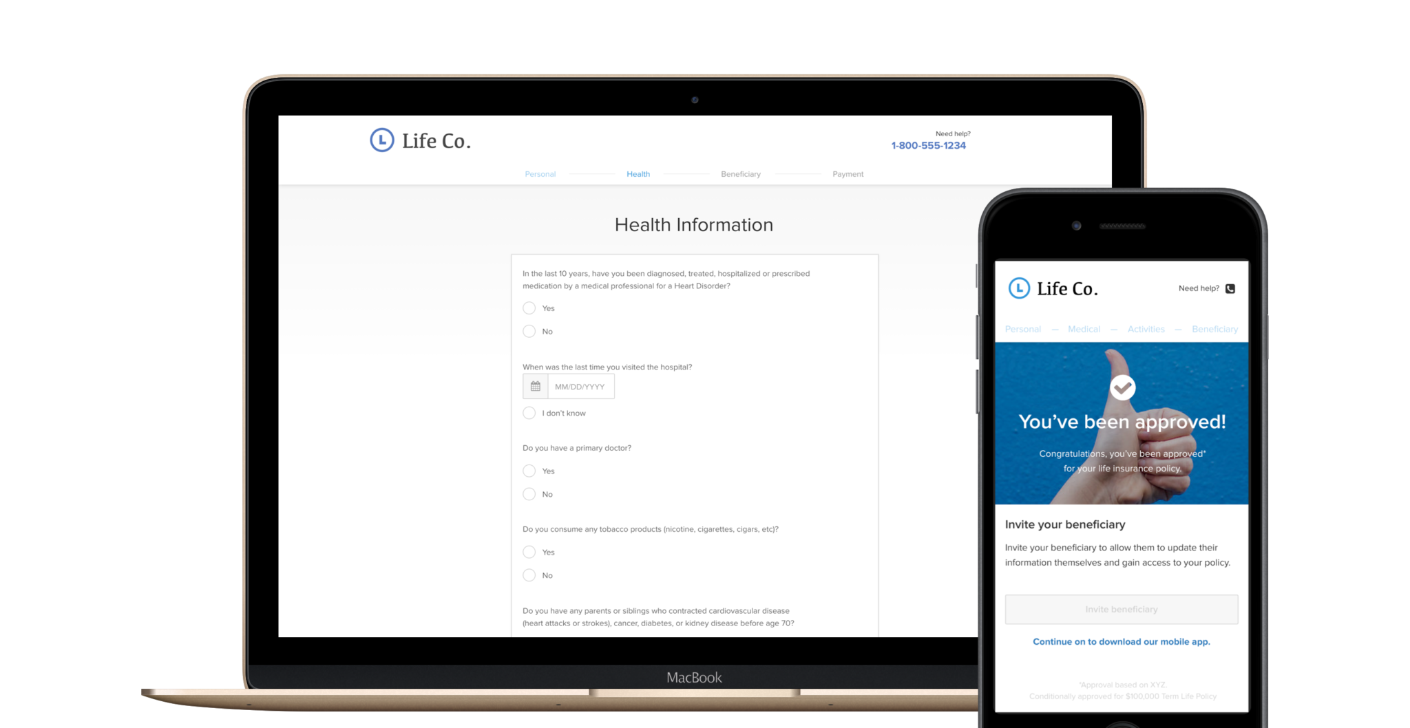
Designing the Apply & Buy Quote Process
THE PROBLEM
Why is it so complicated to buy Life Insurance ?
THE QUESTION
How might we recreate the entire customer journey of purchasing Life Insurance as a web and mobile experience ?
THE SOLUTION