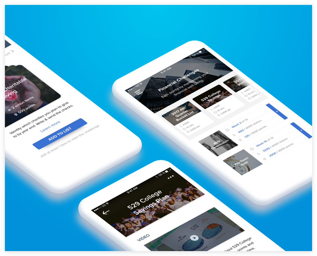
Financial Challenges
Rewarding life insurance policyholders for taking care of their financial well-being.
The project describes my process of conceptualizing a financial challenge which Sureify wanted to introduce as a new feature in their consumer-based mobile application. The project has undergone four stages of design and is currently launched in the mobile app. This case study talks about the initial two stages.
The Ask
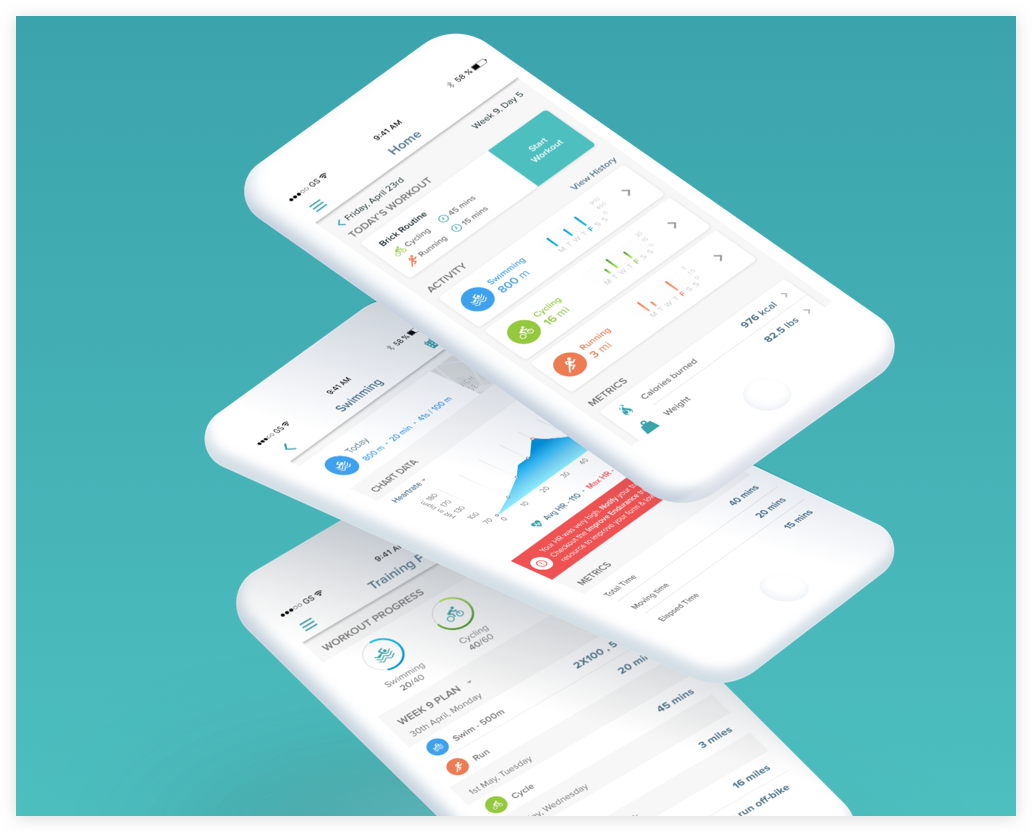
Currently, Sureify’s consumer app allows policyholders to participate in health and wellness based challenges (image on the right). Envisioning financial challenge was something that Sureify wanted to introduce as part of their product offering. The premise of a financial challenge was to reward life insurance policyholders for taking care of their financial well-being. For the product team, it opened up a beautiful design problem to solve – “How might we envision a financial challenge to help policyholders maintain their financial well-being.”Policyholder wants to participate in a financial based challenge
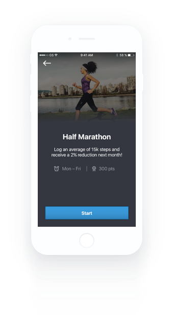
Health and Wellness Challenge
My Role
I led the design of the project as an Interaction Designer. I performed stakeholder interviews, understood the target users and ideated different challenges. After multiple iterations of wire-framing, I was able to provide basic structure to the concept of a financial challenge. I then created user flows and high fidelity prototypes using Sketch, Invision & Framer. The first phase of project conceptualization and design was completed in four weeks of an agile product sprint. I am currently working on simplifying the challenge types and refining it for an August release.Stakeholder Interviews
Stakeholder interviews help generate a lot of information and insights about the domain of work. Conducting a Stakeholder interview allowed me to learn more about the benefits to the business and the users with the design of a financial challenge. I had arranged video conferences with the CEO, COO, and the Head of Business Development at Sureify. Since the concept of a financial challenge was new to me, I had to ask the stakeholders to document and draw out their vision to understand their expectations.Understanding the business and what insurers need
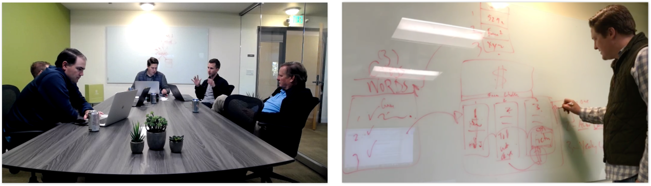
Fig. Meeting with stakeholders to understand expectations(left). Dustin(CEO) sketching the idea (right).
Key Questions that were covered1. Why do we need a financial challenge?
4. What makes a financial challenge unique?
2. What is this challenge supposed to be like?
5. How do you want users to envision this challenge?
3. What kind of user problems does it solve?
6. What are the business goals we need to achieve from this challenge?
Insights Gained
What did I learn from the Interviews


How will a financial challenge benefit the policyholder?
Financial challenges allow policyholders to earn rewards to begin thinking about their financial security.
How will it benefit the Life Insurance Company?
Insurers can tie in with other product offerings through a financial challenge, thereby serving as a cross-selling and up-selling springboard.How Might We’s
The target user for this challenge is practically any policyholder who is interested in savings and investments. After synthesizing the research data and understanding the target users, I was able to come up with How Might We’s to steer the design in the right direction.
Users would like to manage their financial well-being
How might we envision a challenge where users can manage and achieve their financial goals?
Policyholders would like to save money for their children
How might we encourage users to start investing to save money for their kids college through a financial challenge?
Policyholders would like to get educated regarding financial planning
How might we create a financial challenge to educate users to think about financial planning?
Policyholders expect a better experience participating in a financial challenge
How might we make this engaging and interactive so users don’t feel that it is complex and hard to complete?Brainstorming
I held video conferences with the stakeholders to brainstorm and conceptualize the challenge structure. We used to document the ideas on a shared google doc. After documenting different ideas, I used to quickly sketch and create wireframes to validate those ideas with the stakeholders. Through rapid prototyping and iterations we were able to refine two challenge types explained below.Forming the financial challenges and understanding its structure
Two different challenge types were conceptualized

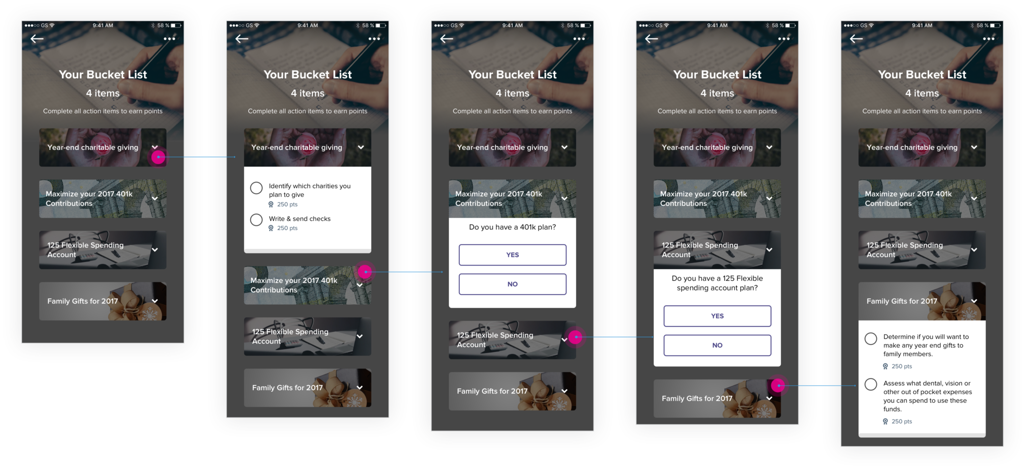
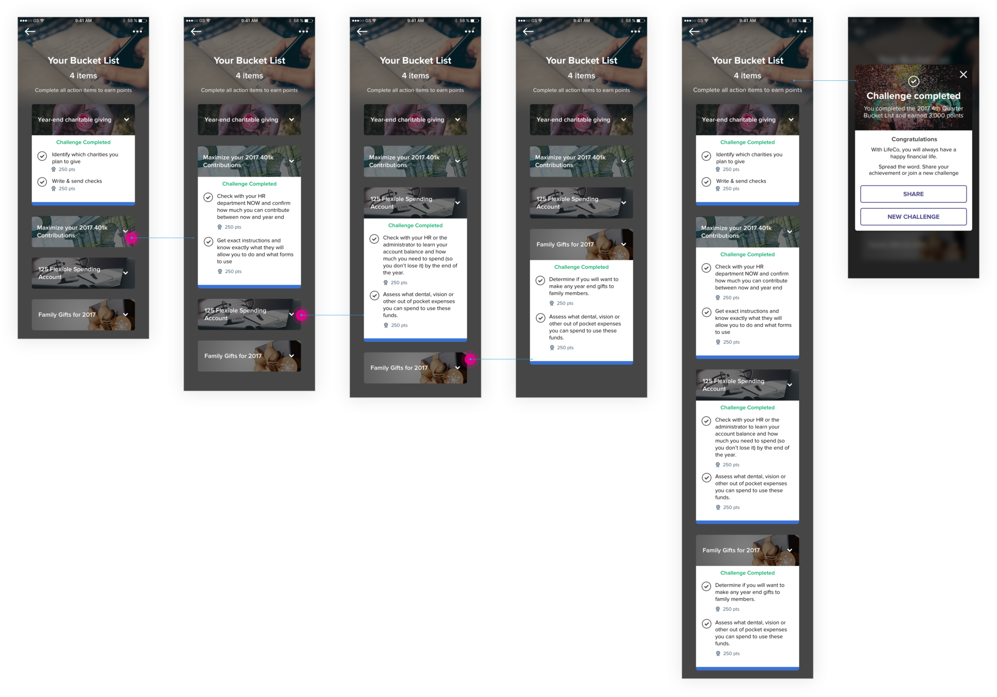
1. Checklist based challenge
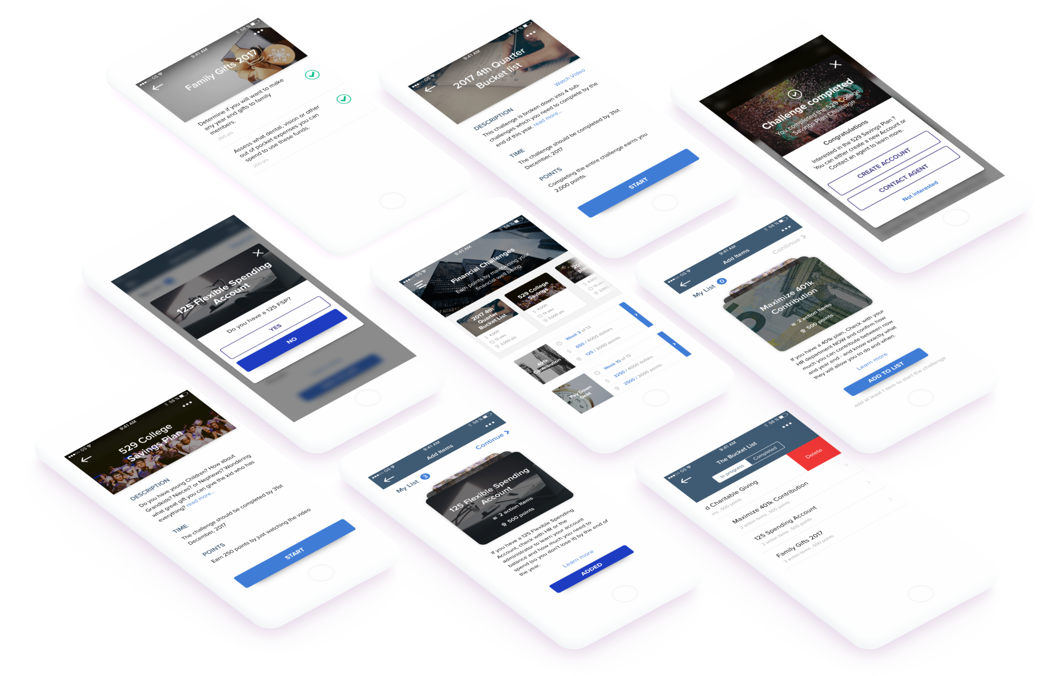
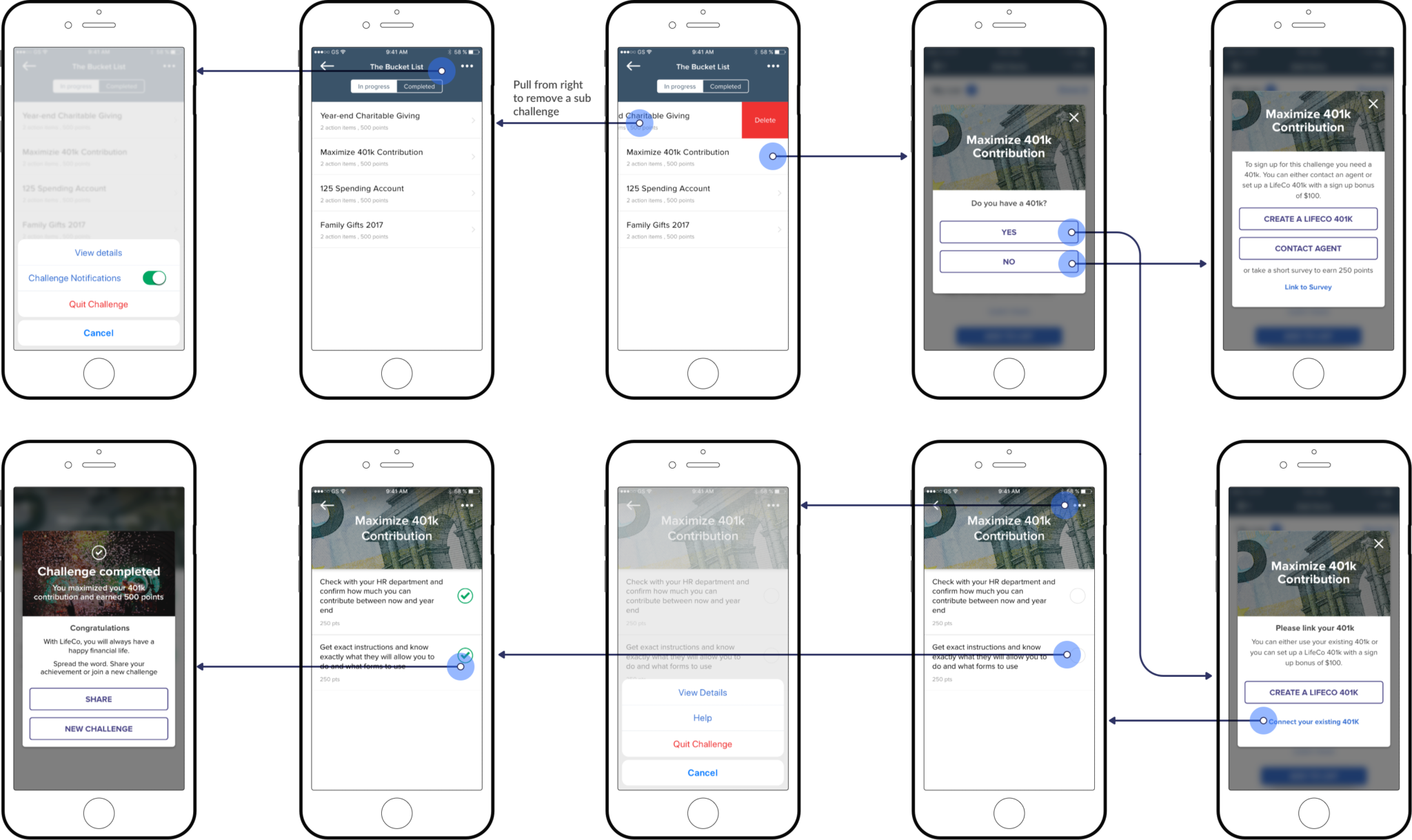
We ideated A Bucket List challenge made of separate sub-challenges. Users would have the liberty to select challenges based on their interest. Each sub-challenge will have certain action items which will be self-reported once the user completes it. Some challenges will be linked to bank accounts e.g 401k, Roth IRA, 125 FSA. The completed actions will be validated with a financial advisor. Upon successful challenge completion, the user is greeted with congratulations and reward points.

2. Educational Challenge
Ideated two different challenges that would educate the user and encourage them to think about savings and investments. One challenge is the 529 College Savings Account where users would watch a company branded video and rate it on a scale of 0 to 10. For the insurer, the challenge opens up a cross-selling opportunity giving users a chance to open an account. We wanted to design a simple educational challenge with instant gratification in mind.
Epics and User Stories
Epics are stories that provide an overview of the features. They helped me think through my design decisions, to create and provide a useful user experience. In my case, epics included what the user can do: view challenge details, view sub-challenge details, perform challenge specific actions, perform actions after completing a challenge, and change settings. I continued with writing user stories as part of agile methodology to capture the functionality of a product. I created detailed descriptions of what the user can do.
Wireframes
My next step was to visualize the user task flow for each challenge type. After designing each wireframe I used to create a clickable prototype and ask the stakeholders to validate the designs. The designs went through two phases of initial wireframing before jumping onto the visual design.Visualizing the user task flow


Visual Design – Phase One
After reviewing the wireframes, I was asked to rapidly prototype phase one of visual design. I took inspiration from the design of existing health based challenges. I made use of the existing style guide and modified the components based on the content I was dealing with.Adding style to the wireframes
Usability Issues
The phase one designs were evaluated by the stakeholders and I received valuable feedback. Key usability issues were identified. I was happy to understand the weaknesses in my design so that I could learn from them. I have explained the issues below.Receiving valuable feedback & identifying weaknesses in the design
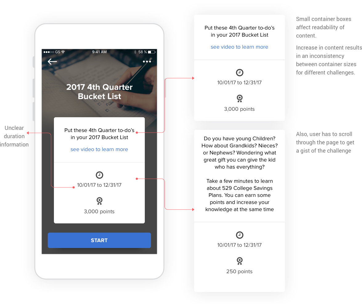
1. Details Container
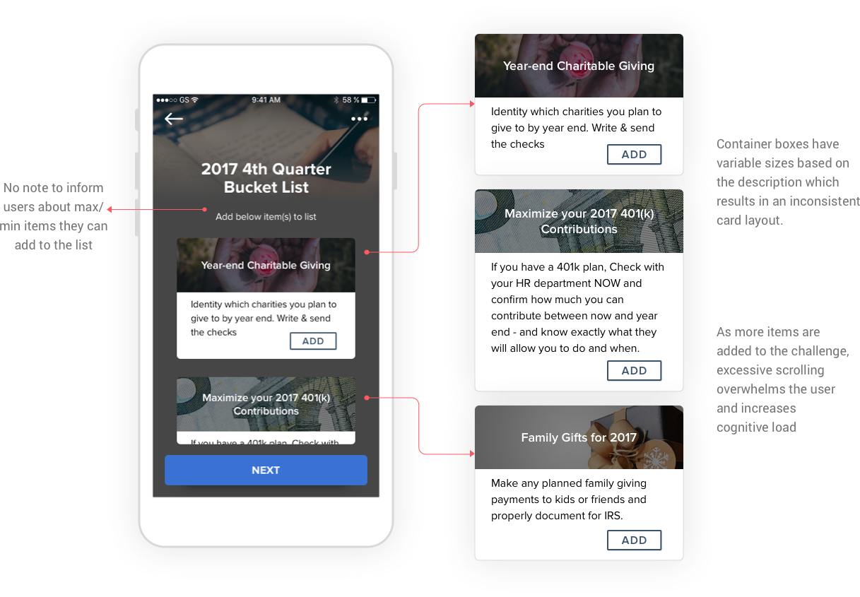
The size of the challenge description container is small which affects the readability of the content. As content increases the container size differs for each challenge description which results in inconsistency in the layout. The user ends up scrolling through a long piece of content to get a gist of the challenge.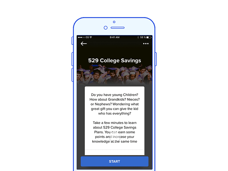
2. Sub-challenges list
On this screen, the user has no information of minimum items to add to begin the challenge. The user again scrolls through the list of items which increases the cognitive load. Since the description of each sub-challenge is different, this results in an inconsistent card layout. Also, the screen doesn’t show a counter stating the added items on the list.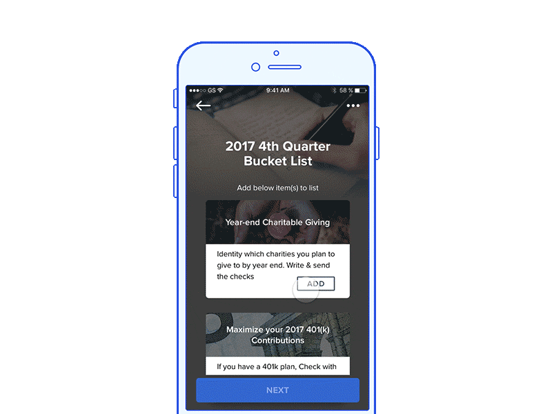
3. Challenge Accordions
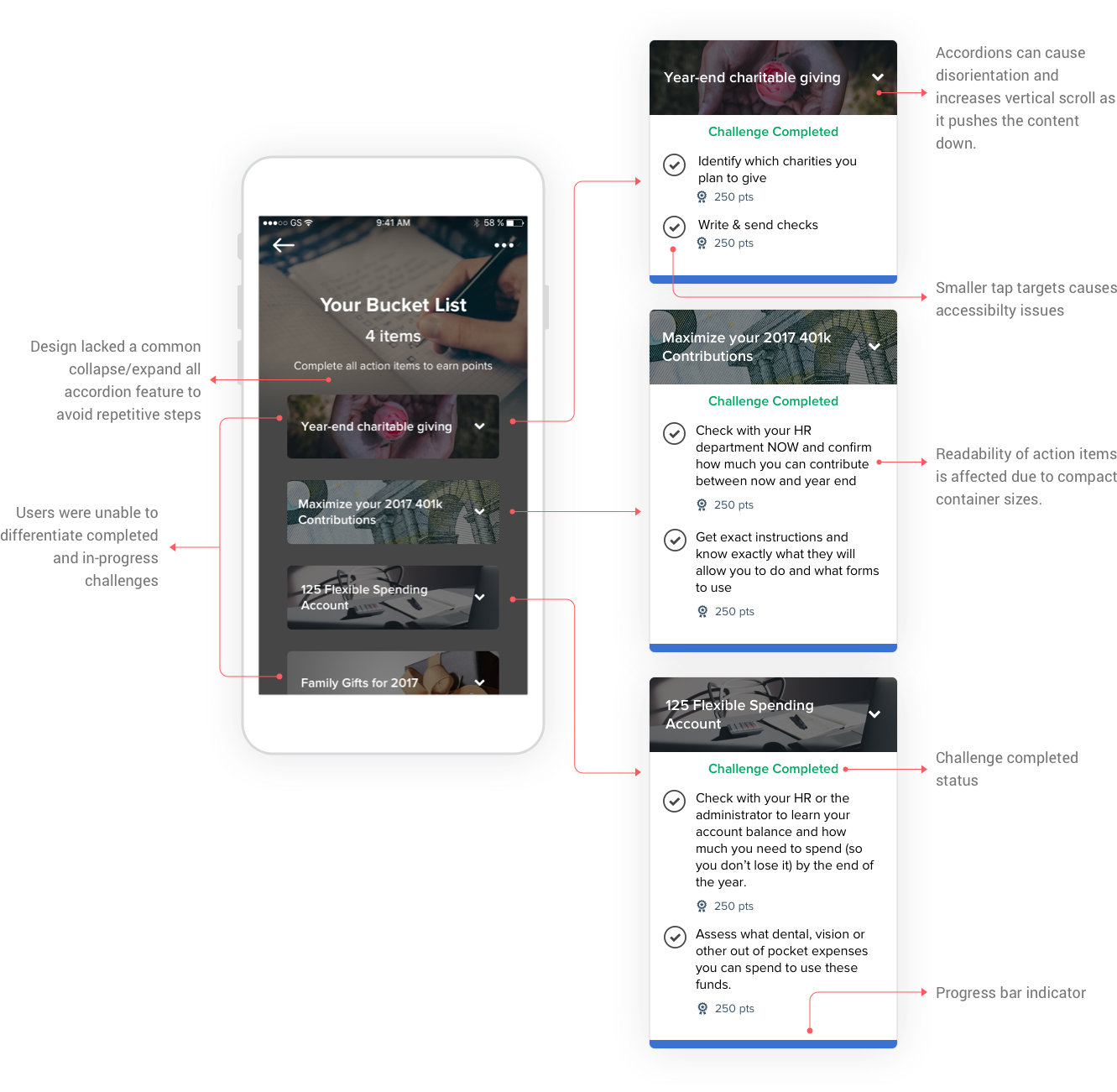
Although accordions conserve space on mobile, it pushes the content down. This causes disorientation and further scroll. Also, the design lacked a common collapse/expand all functionality for the accordion structure. Additionally, the readability of action items was affected due to an ill use of screen real-estate and small container boxes.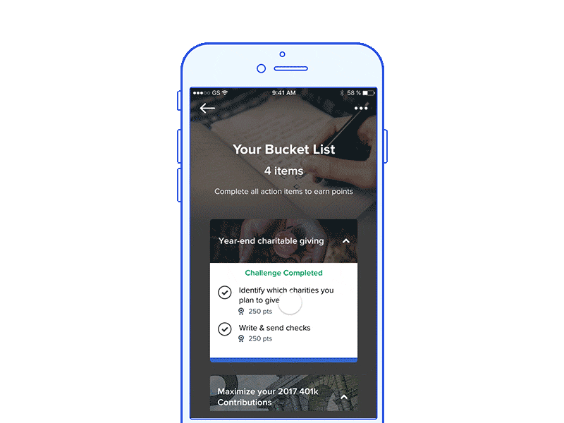
Reflections on feedback
After receiving feedback, I reflected on my work and learnt that my design lacked clarity. I tried to make it look aesthetically pleasing but evaded from usability. I learnt that Aesthetics need to be balanced with usability. Also, the design lacked interactivity couldn’t motivate the user to use it for long. I had to iterate again and avoid the above issues. The lead product designer advised me to ask myself three questions while evaluating my designs.
Rethinking the Application flow
I had to re-think the application flow to avoid the usability issues discovered. My goal was to design interactions that make good use of screen real estate, show clarity and reduce cognitive load.Rectifying the mistakes made and starting again

Visual Design – Phase Two
After reviewing the re-designed application flow, I received the green light to iterate another version of the high-fidelity designs. This time my approach was to provide clarity of content to the end users. I made sure to look into each edge case and allowing users complete flexibility to control the challenge options.Introducing Financial Challenges 2.0
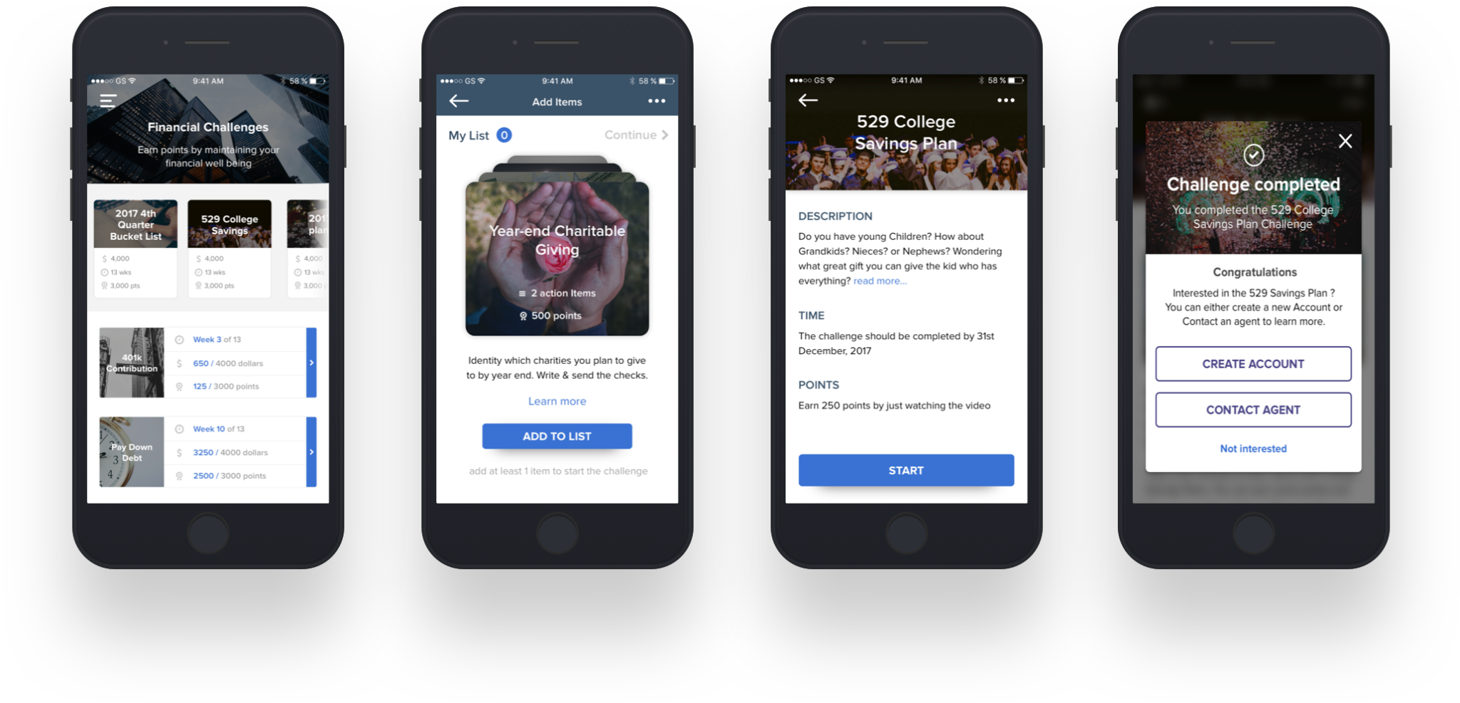
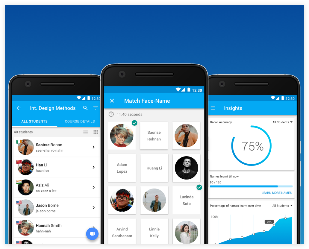
The Bucket List Challenge
Tick off action items to earn points
Getting Started
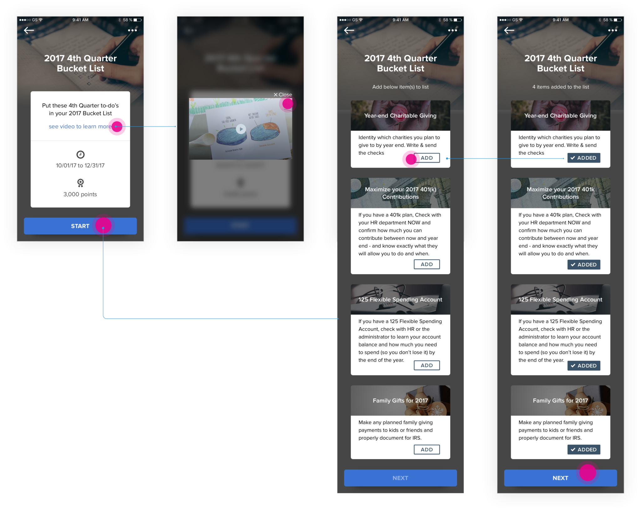
Policyholder selects the bucket list challenge and is presented with a challenge description, duration, and points. Policyholder chooses to watch an explainer video, gains interest and starts the challenge.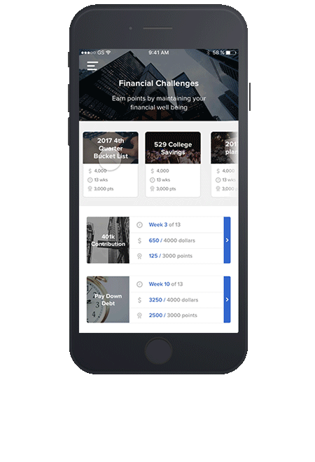
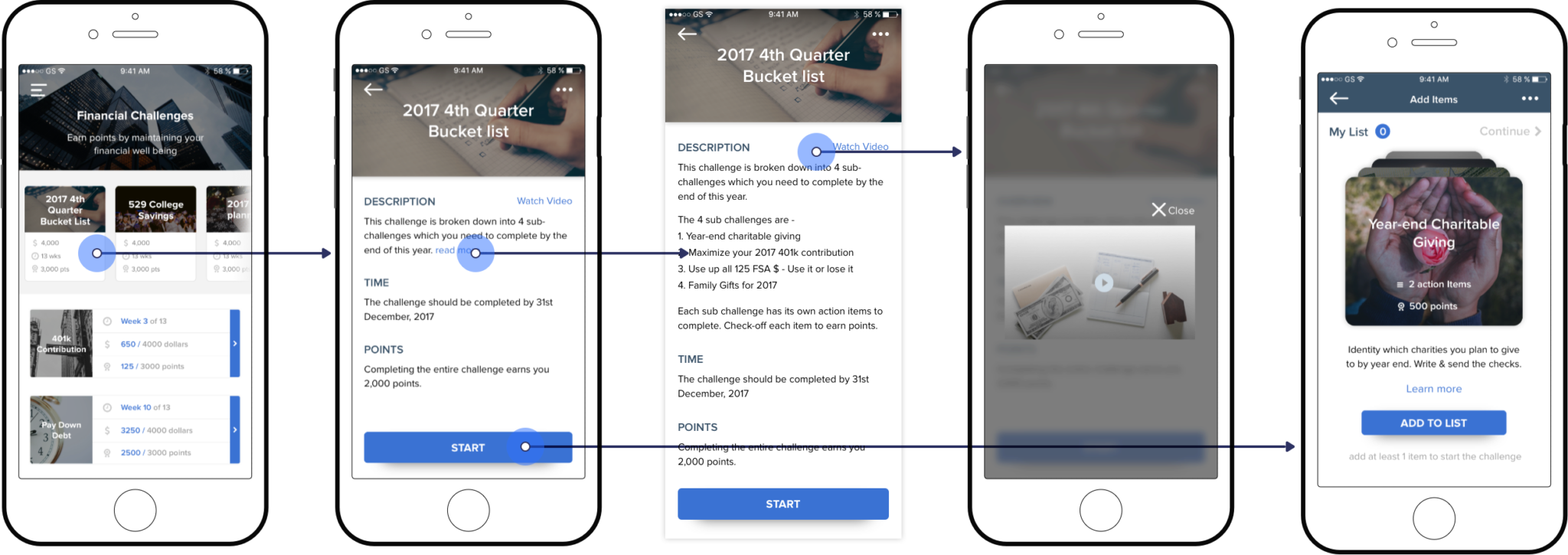
Shuffle & add challenges
By designing a vertical card swap layout, I could eliminate the problems of excessive scrolling. The content for each challenge was restricted to two lines with a learn more link to understand more about the challenge. Policyholders can add interesting challenges to the list by tapping on the add button.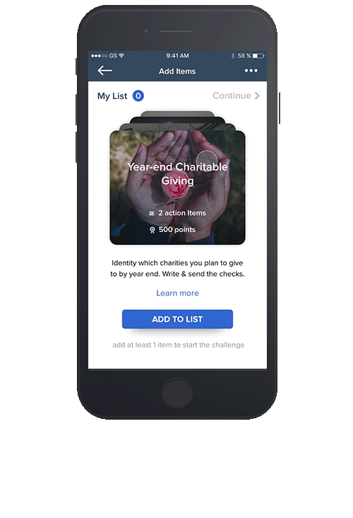
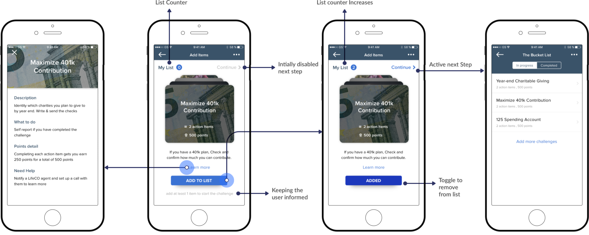
Check-off Items & Earn Points
After selecting a sub-challenge, my list counter increases, the policyholder selects the continue link and is presented with a clean list of challenges. The curious policyholder views the action items, self-reports it, and earn points.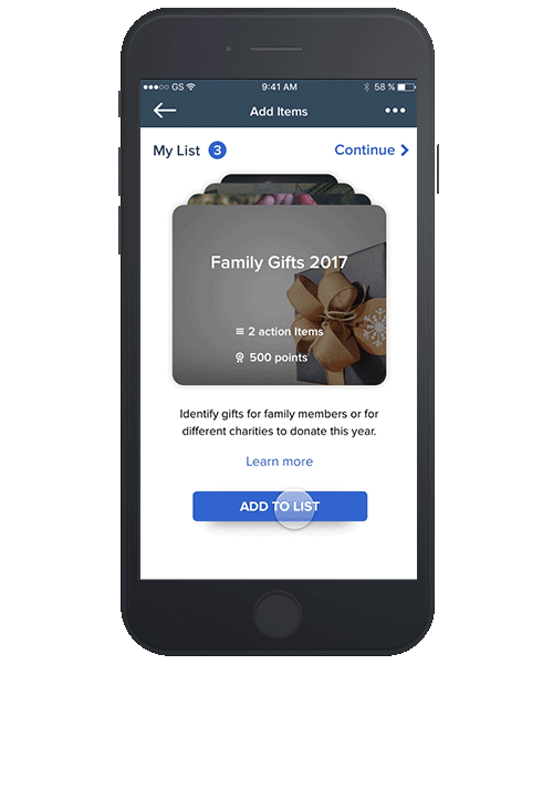
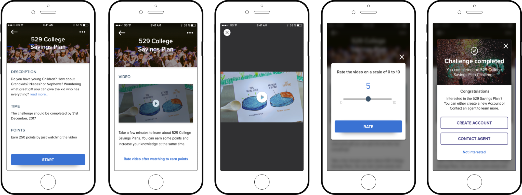
Educational Challenge
Learn. Rate & Earn Points
In this 529 College Savings challenge, policyholders will have a chance to learn about the value of investing in a 529 savings account. Policyholders will rate promotional content (video) by the insurer and receive points. Upon challenge completion, the policyholder can either open an account or contact an agent to learn more about a 529 plan.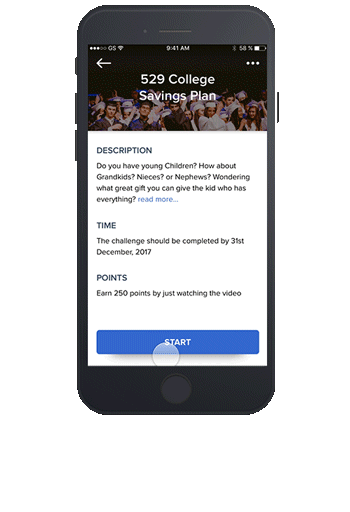
Next Steps
I am currently working with the team to refine the financial challenges scope and structure. I am digging deep to understand the business value and want to test the iterations with potential users. Some changes in store 1. Make each sub-challenge a separate challenge 2. User on-boarding designs 3. Interactive error/success state messages. 4. Usability testing to identify problems. 5. Ideating new & easy-to-complete challenge typesLearnings
Designing at a Startup has taught me that I am too young to claim that I know what I’m actually doing. At Startups, there is no set process to go about delivering a product to the world. I have to work with an open mind and learn as I go. Conducting user research is difficult due to the budget and time constraints. However, feedback received from stakeholders on my approach and designs is research at a startup. Majority of the time, Sales drives the product and I have to learn to listen and deliver according to the needs of the business/market first.If you’re not embarrassed when you ship your first version you waited too long.
– Matt Mullenwegg
BUILD – TEST – SHIP – ITERATE
Thank you so much for scrolling through and reading my case study. Here’s your reward.