OVERVIEW
Autoimmune Hepatitis (AIH) is a rare and incurable non-viral disease which affects the liver. Due to its rarity, support for patients with this disease is often provided over social media platforms to patients who ask health and medical questions about their disease and how it affects them.
OUR GOAL
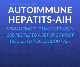
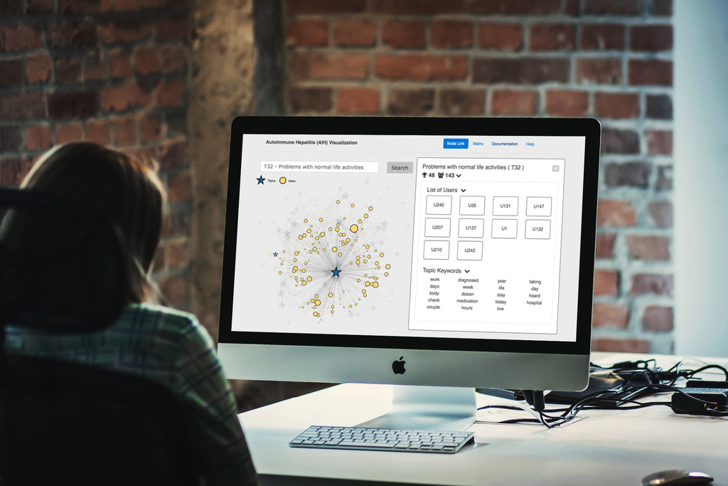
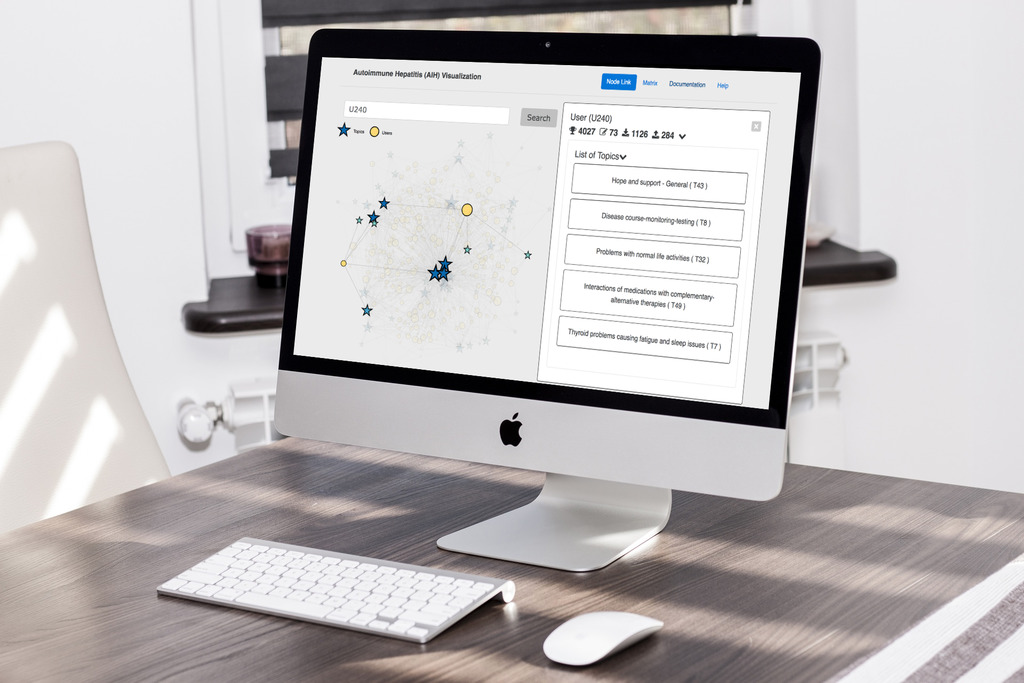
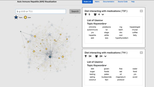
Our task was to visualize links between 280 people who actively spoke about AIH, to a set of 50 most frequently discussed topics. By understanding underlying patterns between the patients and the health topics they discuss, it is possible to gain insight about the issues AIH patients generally face. This tool can also extend to act as a platform to create awareness among those who are inexperienced with the disease and can contribute to improving the conditions faced by every patient who is affected by it.
THE SOLUTION
See the visualization live in action
THE DESIGN PROCESS
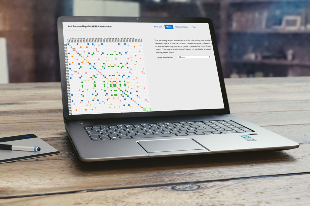
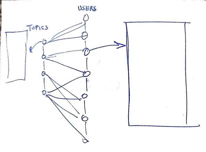
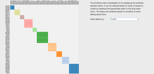
Since our visualization’s main objective was to effectively convey the links between users and the topics they talk the most about, we looked into different forms of graphs and node-link representations. Initially, we considered implementing a bipartite graph but decided against it as it would not be effective to use it to show links between 50 topics and 280 users. We then decided that the best way to represent this data will be with node-link clusters, topics, and users being different clusters with different shapes. Size and color were used to encode the popularity of the users and the topics. We implemented a similarity matrix to represent the similarity between the topics.
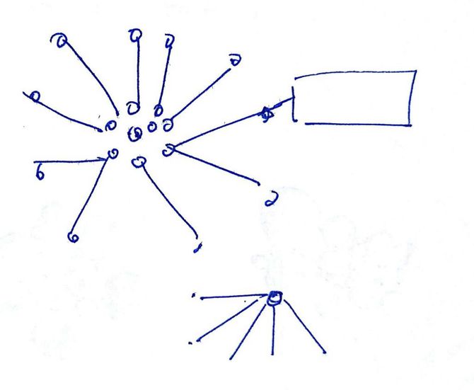
INITIAL SKETCHES
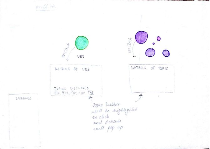
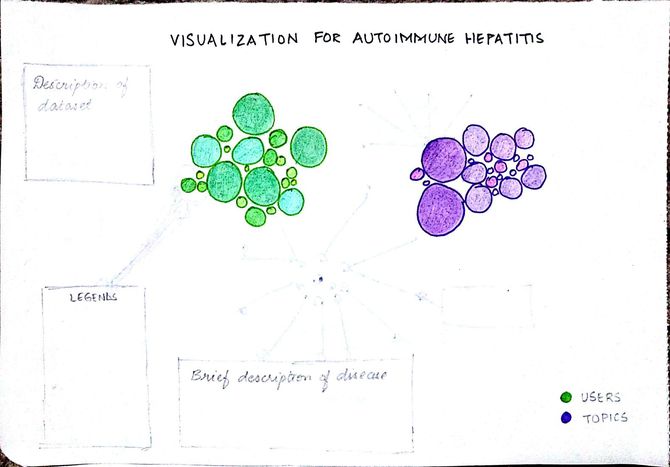
We came up with a few sketches for the visualization, we thought of making use of a bubble chart, a node-link diagram, and a bipartite graph.
VISUALIZATION VIDEO
The video provides an explanation of the visualization and how does it benefit the target user
RATIONALE BEHIND THE DESIGN CHOICES
Listed below are the reasons specifying why we did, what we did.
- To minimize scrolling as much as possible, we decided to place the cluster on the left and the information pertaining to the node(s) of interest will be displayed on the right.
- To have the maximum amount of screen space to display the information without cluttering the screen and causing a cognitive overload to the user, we used an overlay to have the description of our data and a link to the documentation.
- Information on the cards is displayed in a nested manner and not all at once for the same reason.
- Tooltips are used to get a quick preview of the node’s information without having to click on it.
- On the similarity matrix, hovering over a particular clustered cell will highlight the topics to give feedback to the user of their position on the matrix.
KEY INSIGHTS
Listed below are some of the insights we came across while working on the visualization.
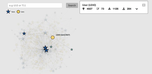
- User – U240 is the biggest user bubble with the highest rank and most number of comments made and received so he must be the Physician
2. There were a few topics that were repeated:
- Complementary-alternative medicine (2)
- Diet interacting with medications (2)
- Disease course-monitoring-testing(5)
- Goals of treatment (4)
- Hope and support – General (2)
- Side effects due to steroid drugs (2)
- Talking to the doctor (2)
- Using last resort medications(2)
Despite the topic name being the same, they have entirely different users talking about them.
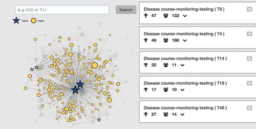
3. Because of the above reason, topics with the same name are in different clusters.
4. Topics with the same name have different keywords
TEAM MEMBERS
Anagha Varrier
Arvind Santhanam
Aziz Khilawala
Chandra Sekhar Sastry
MY CONTRIBUTIONS
Designer & Developer
Technologies used – HTML, CSS, JS, D3.js & PapaParse
DURATION
4 weeks