OVERVIEW
For this project, we had to analyze the 2015 American Community Survey (ACS) dataset. The ACS dataset is annually compiled by the US Census and designed to provide broad demographic and socio-economic characteristics of the US population. We looked at a comprehensive set of variables (approximately 66,000 variables) covering all US areas with at least 65K residents. We had to concern ourselves with a subset of those 66K+ variables representing basic demographics (age, sex, and race), income, housing, and other indicators.
OUR GOAL
Our goal was to visualize these variables using a combination of choropleth maps and other charts (e.g., histograms, bar charts, pie charts, and/or scatterplots). The overarching goal of our visualization was to show the spatial distribution of the phenomena (e.g. the percentage of people under the age of 18) throughout the US while enabling a detailed look into a locality (by showing the population age distribution for a particular state, for instance). Furthermore, the visualization should allow the user to investigate associations between variables (e.g., poverty-level and educational attainment), so as to enable cause-effect analyses.
THE SOLUTION


See the visualization live in action
THE DESIGN PROCESS
Exploring the dataset
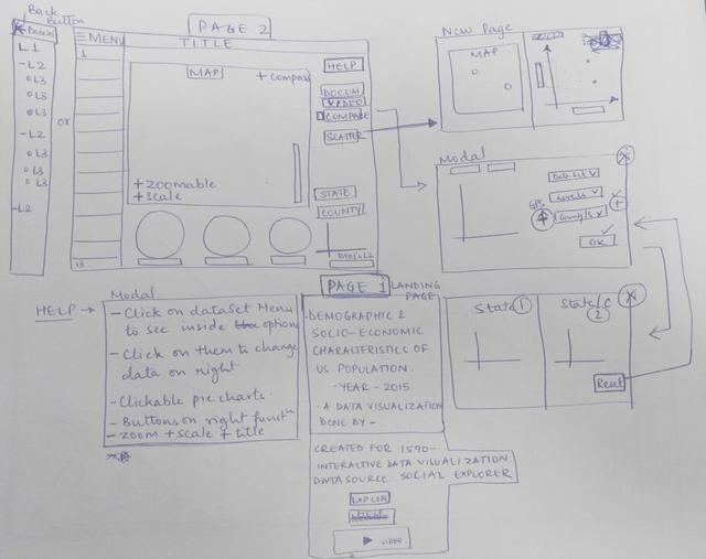
Looking more closely at the 13 variables, we noticed that there was not a system in place for how the variables were organized. For example, some variables had a couple of first levels, but others went straight into a second level or third level. We carefully went through all data sets and variables and organized them according to how many levels were in each variable, as well as which subset variables were in each level.

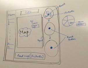
How to visualize the data effectively?
We thought that an accordion style side menu (located on the left side of the screen) with all thirteen variables would be best for the user to navigate through all the 13 variables and its sub levels. Taking into consideration about which graphs and/or maps would best represent the data, we decided that the number of pie charts should equal the number of levels each variable would have. The main choropleth map would change per the pie chart selected (i.e., if ‘male’ is selected, the total male population displays on the main choropleth map, and a new pie chart will appear under the original pie chart to showcase its sub levels).


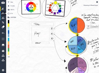
Deciding the color scheme
There are usually six to twelve main colors that are easily distinguishable with each other. However, there are many sub colors that are not completely saturated or different in luminance. We decided that we would use as many of the non-saturated colors for the first and second levels of each variable, and then if needed we will expand our color palette to different saturations of one color.
FINAL SKETCH
VISUALIZATION VIDEO
The video shows the working visualization and what is it about. It also describes how this visualization will benefit the user to learn more about the American demographics.
TEAM MEMBERS
Aziz Khilawala
Jessica Lee-Despard
Onkar Borgaonkar
Swapnil Chandra
MY CONTRIBUTIONS
Design & Development
Technologies used – HTML, CSS, JavaScript, Jquery, PapaParse & D3.JS
DURATION
4 weeks