The Design Process
The data sets received from the US Energy Information Administration needed to be analyzed carefully before beginning with the implementation phase. Since, it was my first time working with such large datasets and using d3.js to visualize it, figuring out what data should be plotted where and how to visualize it needed to be given more thought.
The design process which I followed was to first understand the data variables and its relationship with other variables , then analyzing the data to check if there is any inconsistency in the datasets with any values being missing. After that, I began sketching a few ideas about how the bar chart, line chart and scatter plots would be placed and organized on the page. My thought process for this visualization was to keep the design as minimalistic as possible with relevant functional elements.
Sketches
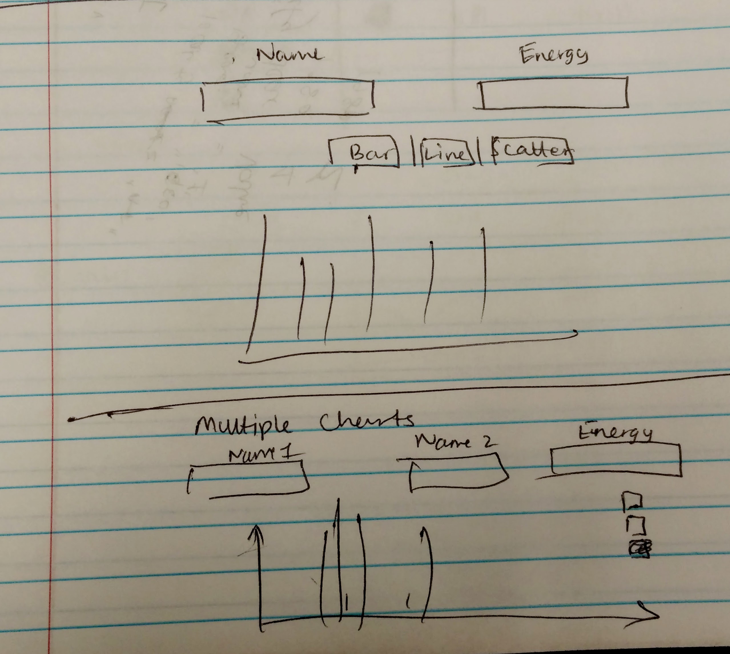
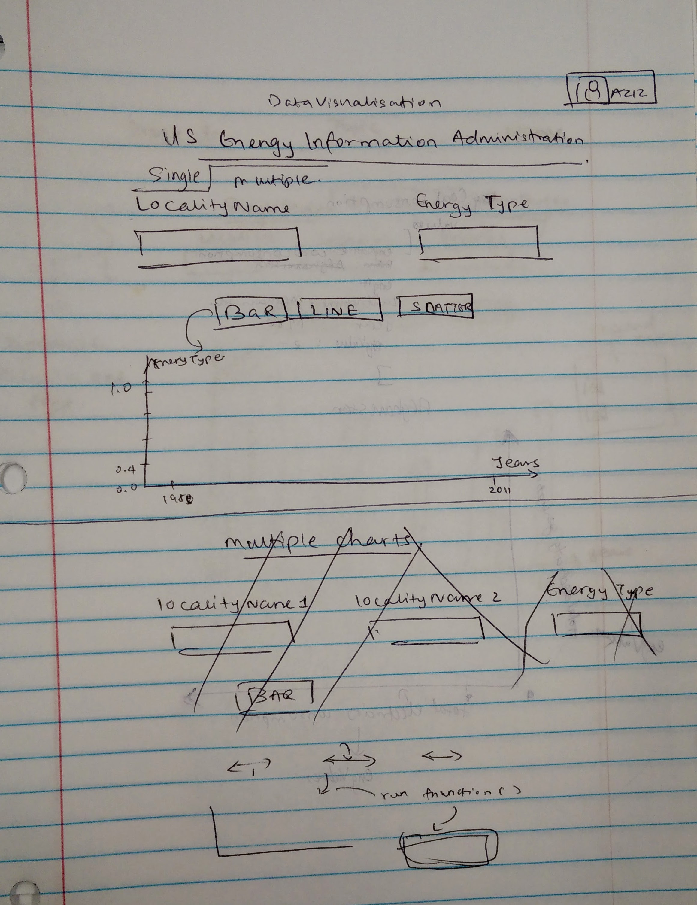
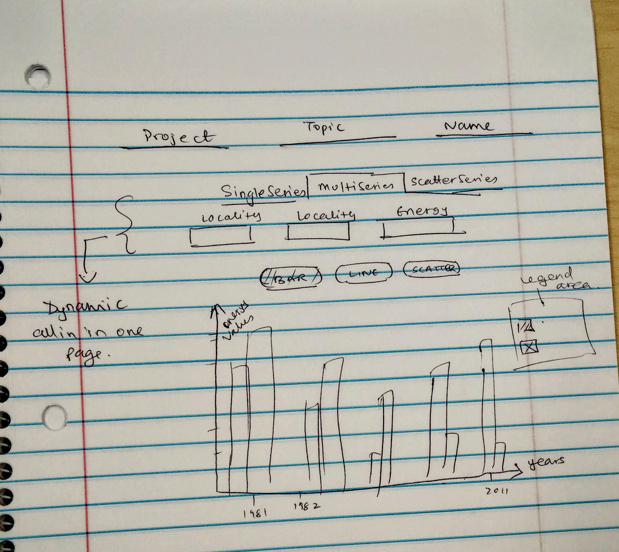
The idea I attempted in the beginning was to toggle single series charts on one section of the page with bar,line and scatter plots. The next idea to was add separate dynamic navigations to the top of the page so that user can select what kind of charts he/she wants to visualize be it single series or multi-series. I thought the second idea was fulfilling my minimalistic design view and then I thought of implementing it for this project.
Design Choice Rationale
While coding the visualizations in D3, a lot of time and thought was spent in building an efficient data structure that would then make plotting values on the screen a smooth process. I iterated the data structure and rebuild it for grouped line and bar charts. The single series visualization tab, since it was single series it was not that difficult to visualize, but for the multi-series visualization tab, the bar, line and scatter plots had to be grouped with respective year values so that the user could differentiate between two different regions, thus to organize it properly, the bars needed to arranged well with proper spacing and correct symmetry.
Since the data was sequential for the single series charts, the color I used was a soft blue hue. The soft blue is less stressful to the eyes especially on a white screen and helps the viewer understand patterns that emerge from the visualization.
For the multiple series charts, I made use of d3’s ordinal scales categorical colors which dynamically adds strong colors to the chart elements. Since it compares different regions, different hues had to be encoded in the visualization.
Visualization Insight
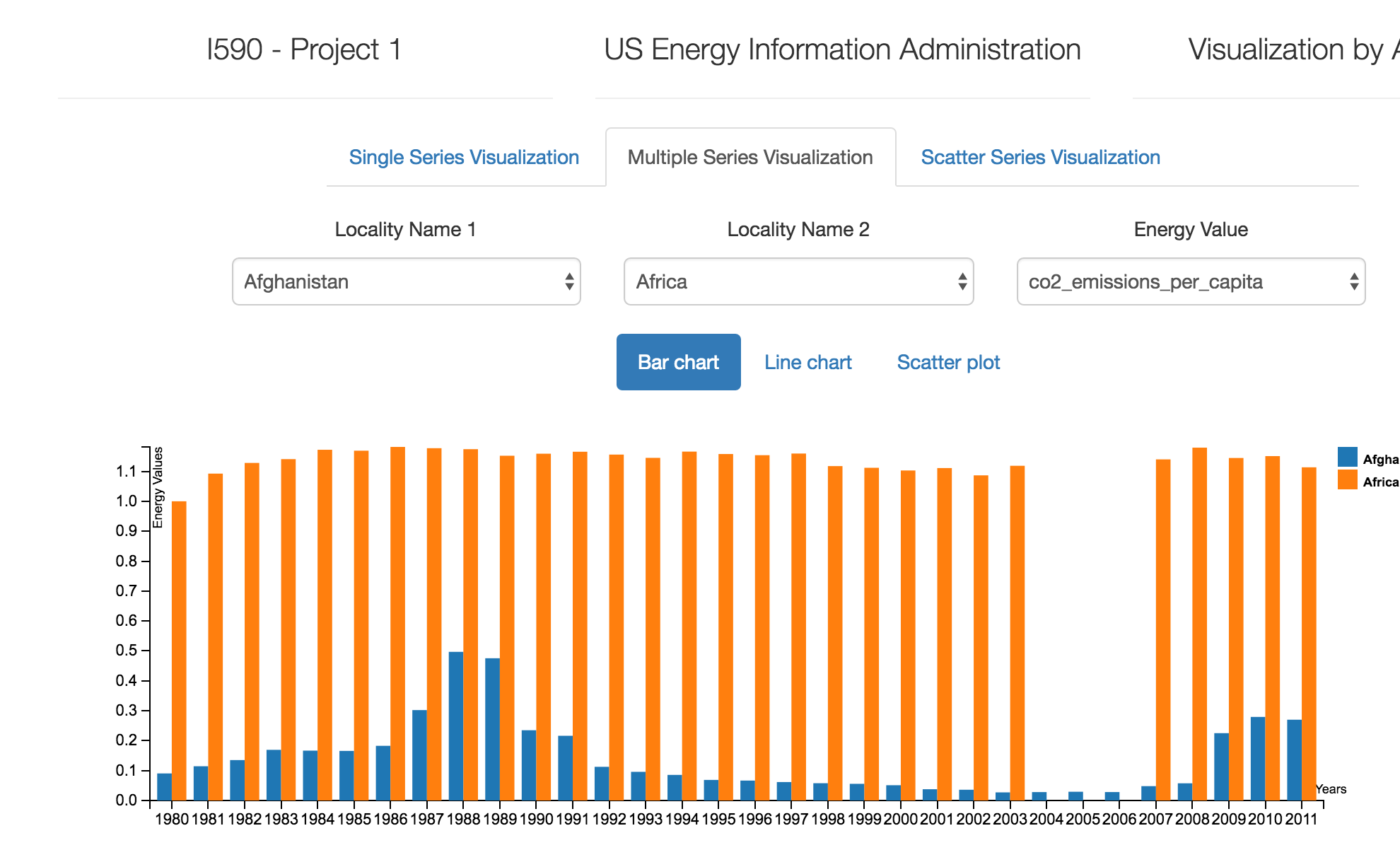
One strange factor I discovered while comparing Africa and Afghanistan’s C02 emissions, we found that Africa was emitting a constant amount of C02 gas consecutively each year from from 1980 onwards, but it did not produce any emissions for three consecutive years namely, 2004, 2005 and 2006. After that it risen again to its previous levels.
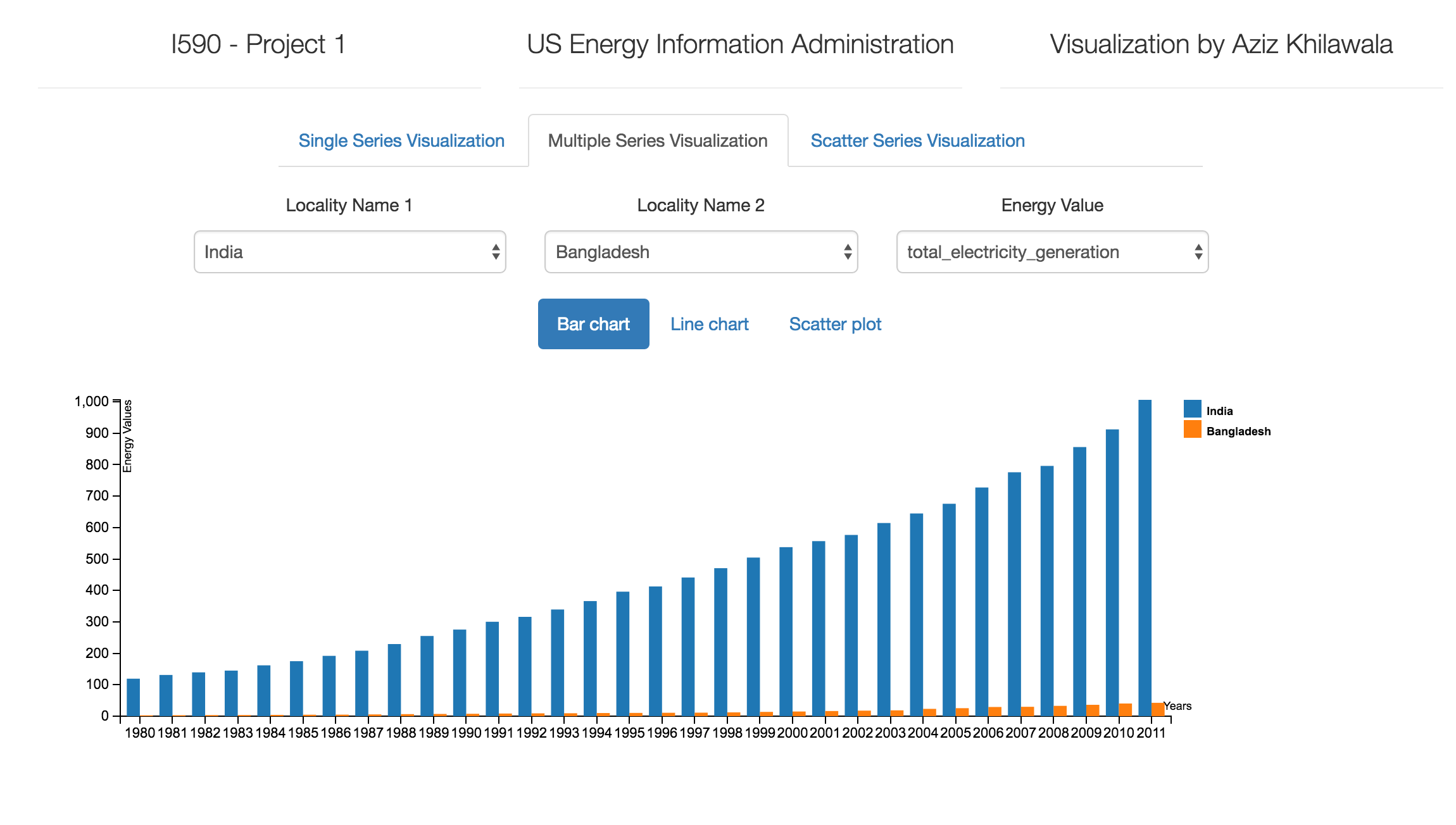
The second factor that I found strange is that India has been gradually increasing its total electricity generation each year as compared to Bangladesh which has a low increase and almost negligible in year 1980. This also proves how population increase, increases natural resource utilization.
Interactive Project Video